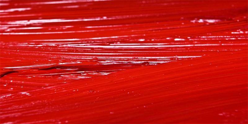
ROSSO: INTRODUZIONE
Red is a strong and energetic color that gives vitality and acts on the body by increasing blood pressure and respiratory rate. Furthermore, it has the power to stimulate the appetite, making it a great choice for decorating the kitchen or dining room.
Feng shui experts, the art of arranging objects to maximize well-being, will already know that each color has its own superpower: its ability to influence emotions and consequently the actions of individuals.
In China, the country of origin of this discipline, red is considered the color of happiness, passion and love. For example, it is common to paint the front door of a house this color to bring joy and prosperity to the residents.
HOW IT IS OBTAINED
To obtain the shade of this color, the primary colors are mixed in this way:
- 100% red
- 38.82% green
- 27.84% blue
The RGB code for the color red is: 255, 99, 71. Among the shades that are closest there are:
- Terra di Siena: #e97451
- Light orange red: #f75e25
- Coral: #ff7f50
- Vermilion: #ff4d00
- Salmon Orange: #e55137.
DECORATE WITH RED
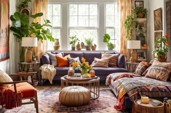
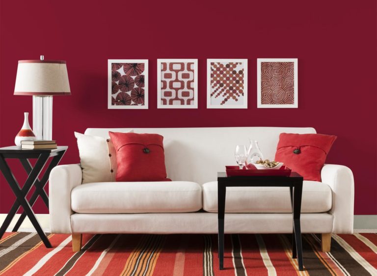
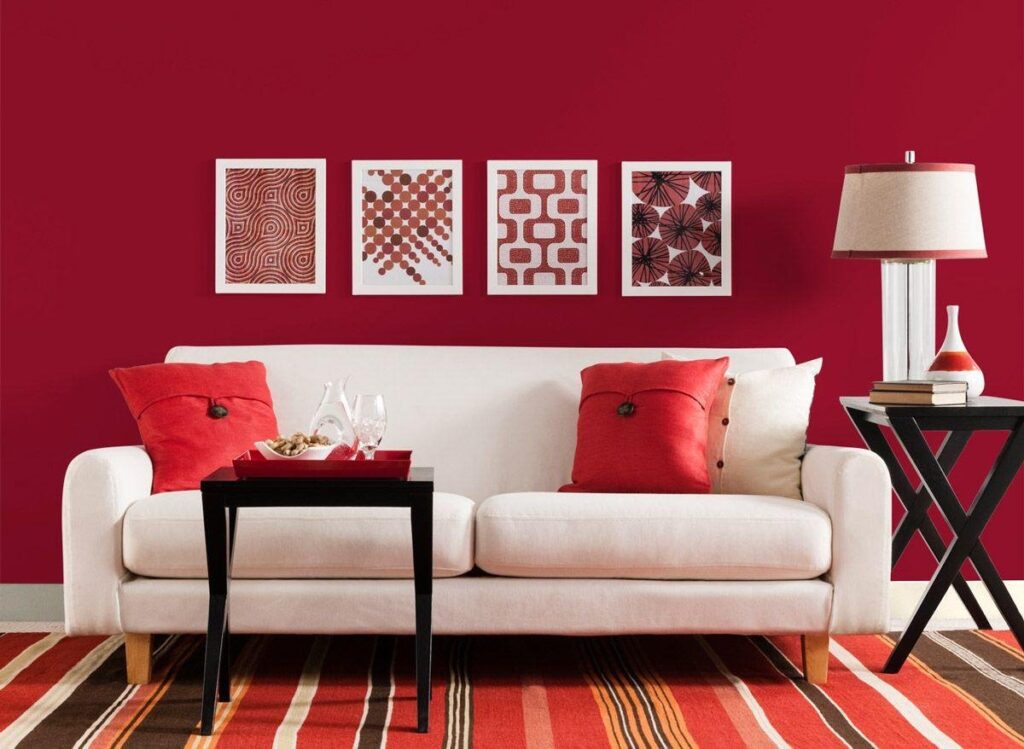
So how can you best use this color in decorating your spaces? A good strategy for decorating a room with the color red could be to choose this color for individual elements: for example, for a chair, for a sofa, or even for a desk, for a sideboard or for an ottoman.
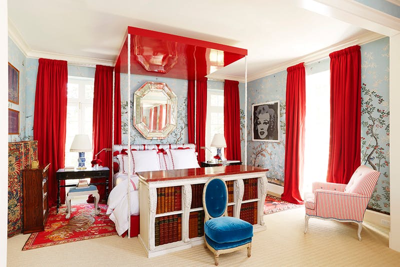
Alternatively, you can decide to distribute red in small doses throughout your rooms. For example, choose cushions in this color or curtains or rugs that recall this shade in their print.
The beautiful Ischia Chair is a perfect addition to your home, adding the color red. In addition to its youthful and modern design, the distinctive feature of this chair is its ability to resist UV rays, which makes this piece of furniture suitable for use in open spaces such as terraces, gardens, or solariums.
USE IN MODERATION
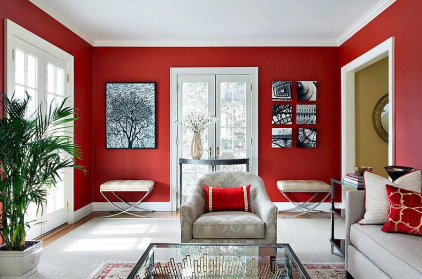
Even if you particularly love the color red, it is always advisable to use this color in your spaces in moderation and without overdoing it with the arrangement of furnishing elements in this color.
When using this color, the most important thing and your primary goal should always be to be able to harmonize this color with the rest of the environment, always following some important precautions.
Using the color red in moderation is essential to find the right harmony. Red is in fact a particularly strong and bright color: just think that this shade is the first that newborns are able to recognize and that they particularly love. Precisely because of its warmth, red tends to make a room appear smaller: for this reason, in a small, dimly lit room, it’s best to avoid painting all the walls this color. In these circumstances, an alternative could be to paint just one wall red, perhaps complemented by a bookcase.
As previously mentioned, red is an energetic and energizing color: for this reason it is preferable to use this shade in the living area of your rooms and not in the sleeping area.
USE A COMPLEMENT
If you’re familiar with the color wheel, you know that green is the exact opposite of red, making it a complementary color. Complementary colors tend to, well, complement each other, so green is a good choice to match them with red. To keep your home from looking like a Christmas card, we recommend getting creative with your palette, like the king of maximalism Tony Duquette did on his Malibu ranch. Here, Duquette’s red-centric teahouse features shades of turquoise green and a couple of minor accents to break it up.
CONCLUSIONS
A good way to decorate with the color red is to choose it for individual elements such as sofas, chairs, armchairs, poufs, desks and sideboards, or distribute it in small doses throughout the various rooms, strategically choosing cushions, curtains or rugs in all-red or with eye-catching prints and patterns.
The key is to pair it right.
For example, paired with white, it instantly looks fresher, while paired with black, it creates a dramatic effect.
A touch of red will be perfect to make a black and white environment elegant and refined or to break the monotony of a gray space.
LEAVE A COMMENT
If you found the article interesting, leave a comment with your considerations on it.
Finally, if you need personalized guidance on decorating with tomato red, send an email to [email protected]! Visit our online portal, CasaOmnia.it!